At the moment, when asking a question, users are confronted with a relatively complex UI, full of relatively unimportant details but completely lacking features that benefit Skeptics.SE.
This impacts newbies and, by making it complex for them to do the right thing, contributes to creating situations where users write bad questions in good faith that will need to be closed.
That is not fun for anybody.
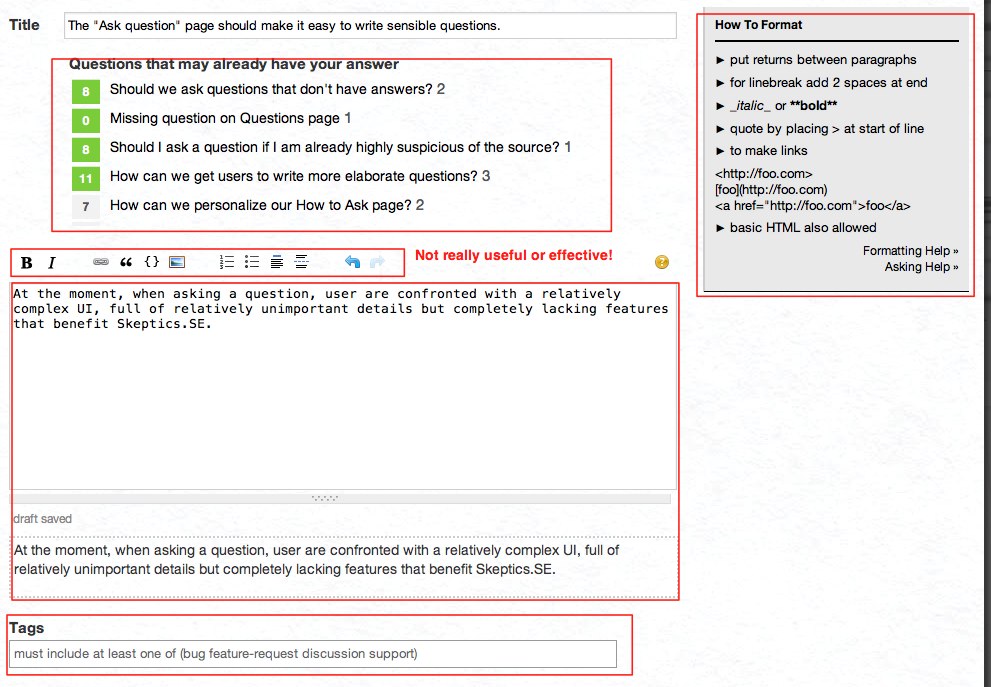
Analysis of the current UI

Let's see what is not working as it should:
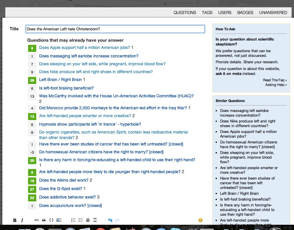
The list of related questions on top. First of all, it's on top! It's in the way of doing what one needs to do which is ask a question. To preempt objections - yes I know that we want people to check whether a question exists. Except, it doesn't work.
How to format. Probably not the most important feature for a newbie. Definitely pointless for someone familiar with markdown.
Formatting bar. Again, we really don't care that much about it (it could be less intrusive and something else could use the space).
Non wysiwyg editor. Not cool for non-programmers.
Tags. How is a newbie supposed to be able to tag if he is not familiar with our tags?
Also: can you spot the problem in the figure below? Where is my form?

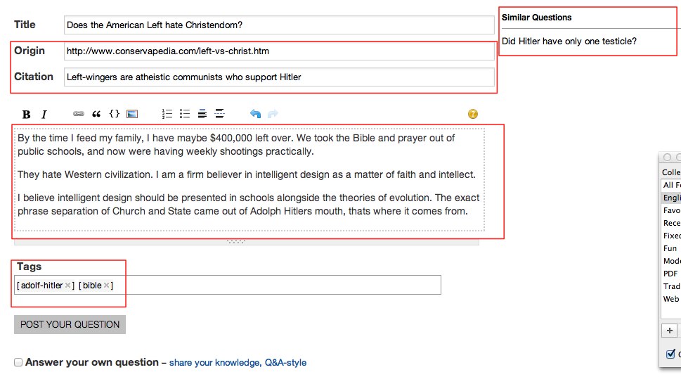
Improved UI

These are the changes I propose:
The pointless Questions that may already... block is gone forever, only the block on the right remains.
Compulsory fields for origin and citation make it crystal clear what we are looking for (there could be a bit more explanation, but this is just a version 1 wireframe!)
There's a WYSIWYG editor! Good for newbs, can be change as a user preference with the current one (possibly without the bar in that case!)
Tags are autofilled from the content. "Join" the list of tags with the tokenized version of the question to find possible tag candidates. Tag candidates are never new tags.
